

The social interactions we establish through social media can be dangerous, but it can be inspiring, as well. This is the story of how my Instagram Friend Mikal inspired me to share & write about this style full of vivid colours that can warm your heart.
The impact of the pandemic on our thought process & emotions is apparent for most of us. As so, I feel that more people are opening themselves to deep connections with what surrounds them or I may be connecting more with my tribe. Either way, the truth is that the feedback regards my photos wearing vivid warm colours amaze people. My friend Filipa – from the Dissecting The Look blog – feel the so-called aesthetic chill. Others feel warm and happy by these value (lightness), hue & chroma which compose the colours you see. The latter case is the example of my friend Mikal who send me a look with these colours while describing his good feeling while seeing it.
In fact, the positive or negative evaluation of colour depends on some factors: characteristics of colour; perception of colour (which depends on the human physiology/anatomy); attributed meaning (influenced by learning/society); colour evaluation (depending on neuroaesthetics and biological networks).
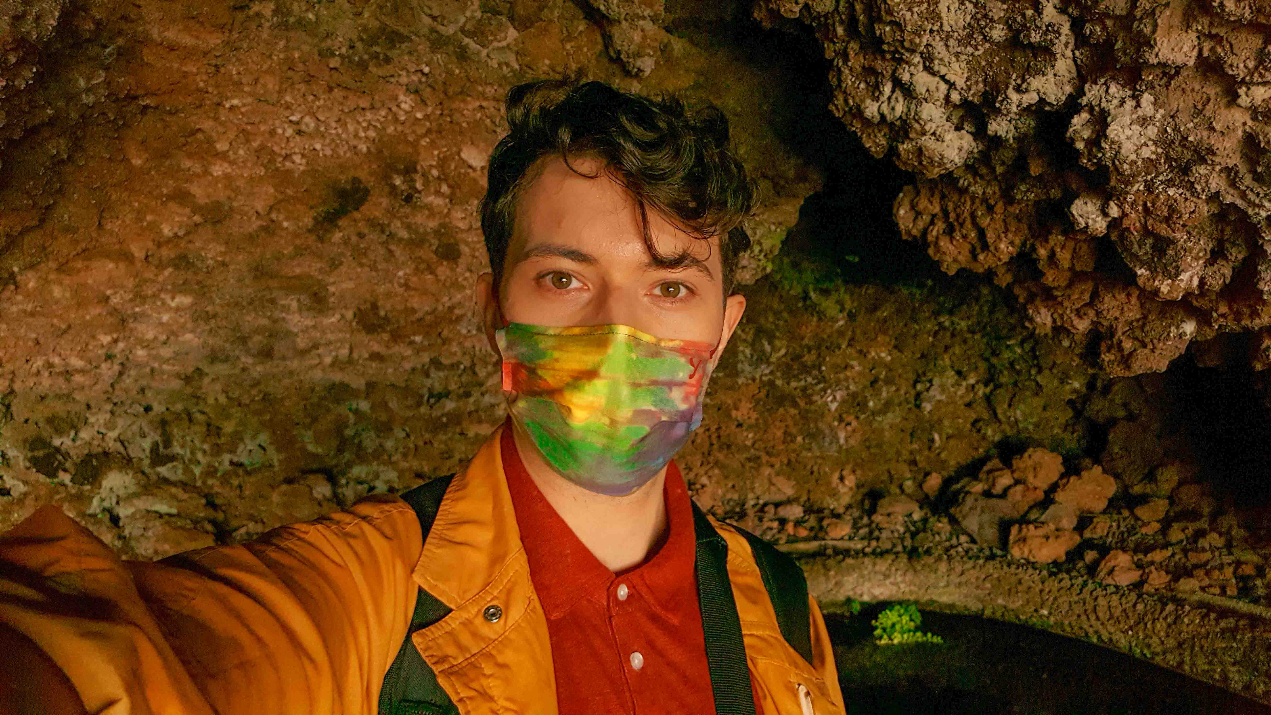
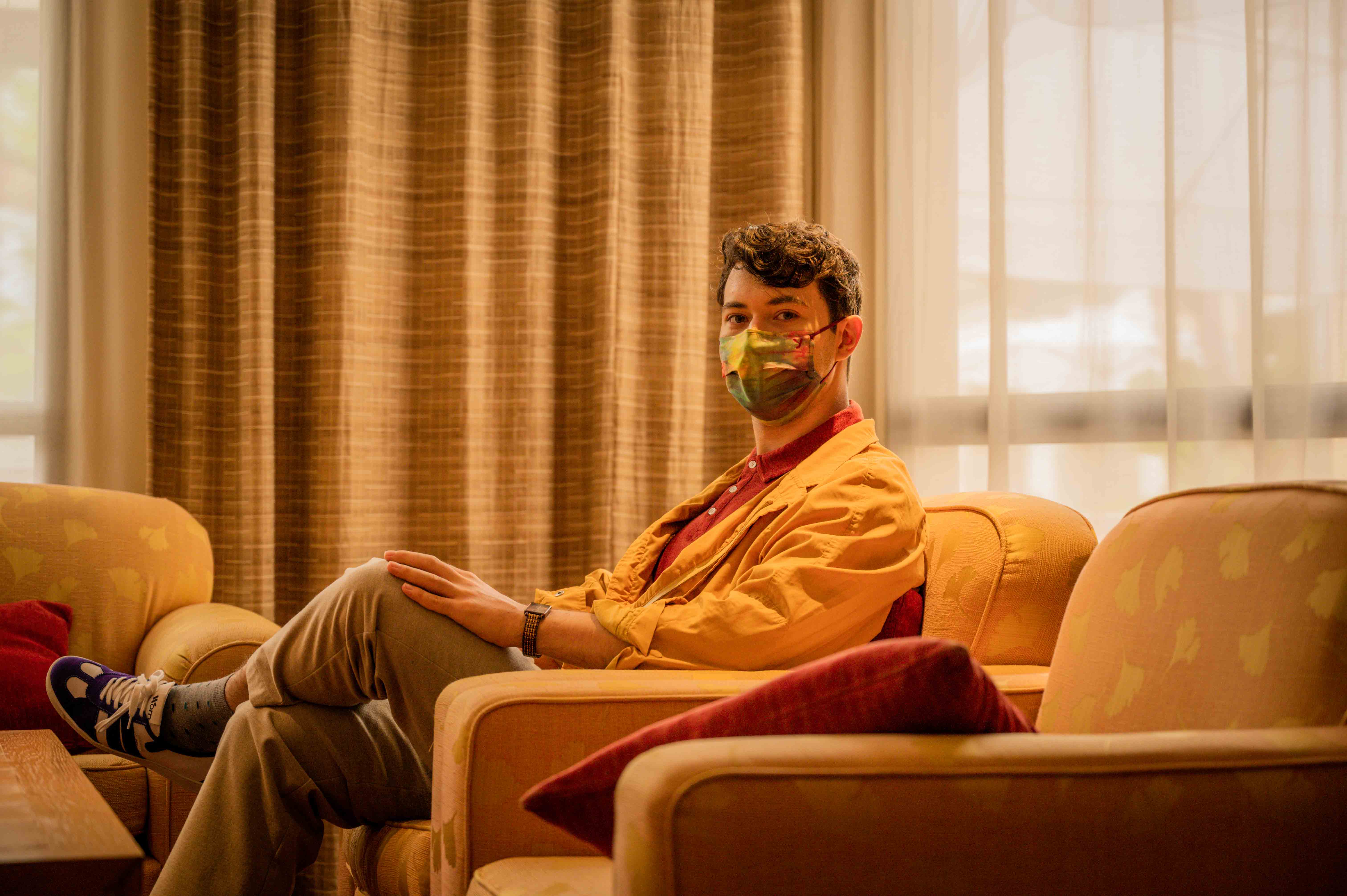
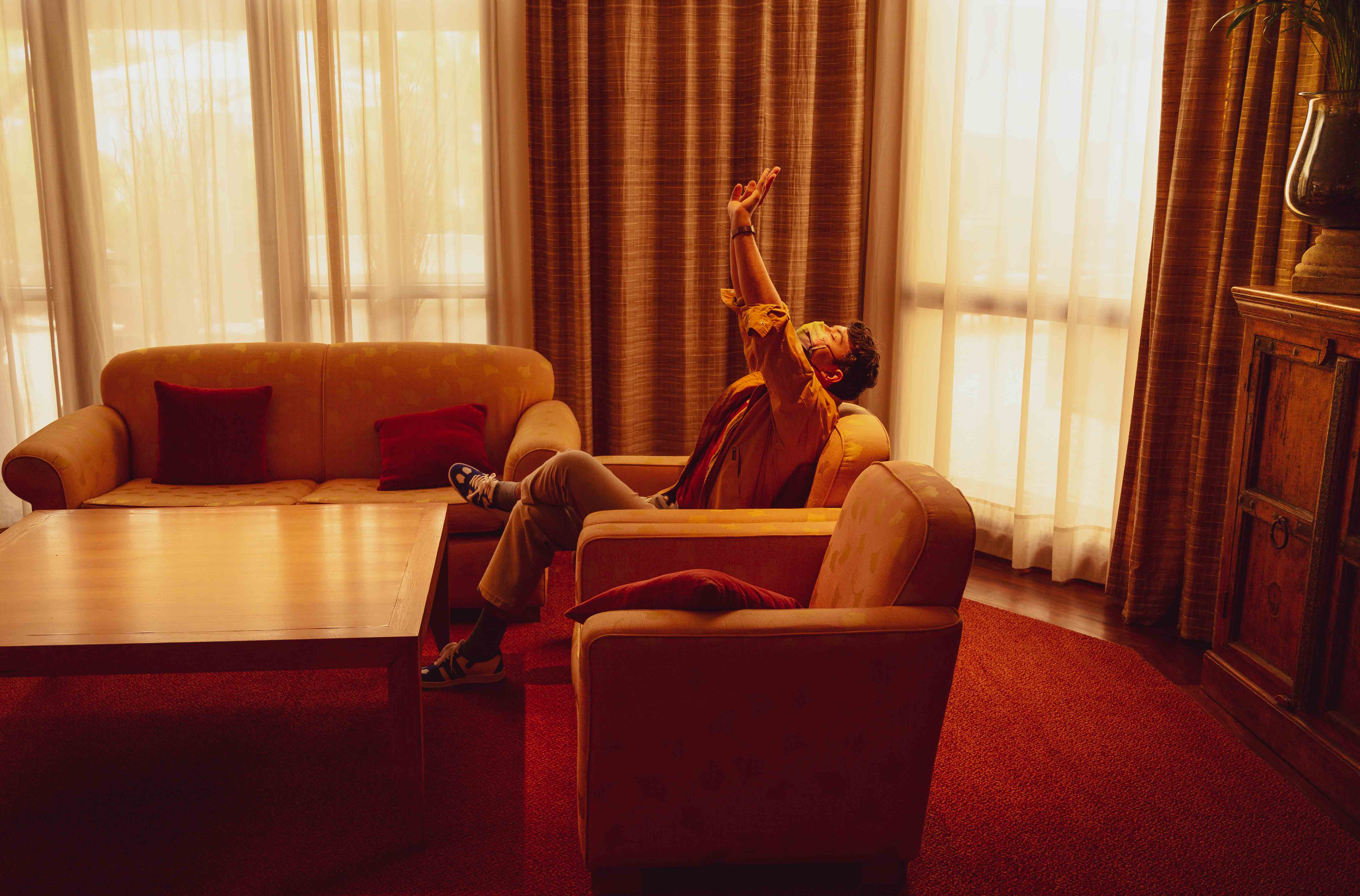
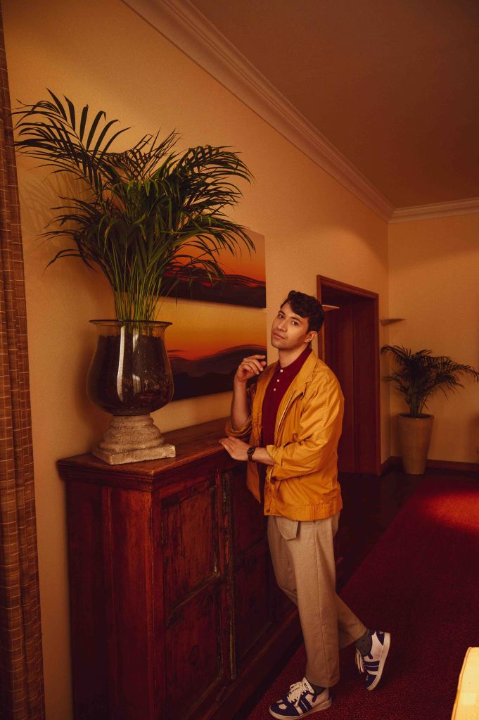
Besides all of the theoretical models & interpersonal variations, in this style, I state a red and orange light wavelengths on the clothes that contrast with the blue light wavelength in the sneakers. I can’t say for sure what was the process behind the effect. But, some possibilities are the subjective alertness promoted by these colours. In turn, this might increase the time spent looking at my style, and then, having enough time to feel appreciation about the subjects – clothes. Also, let us not forget the meaning & associations with these colours: arousing, comfort, daring, happiness, warmth (orange); love, life, energy (red); calm and competence (blue).
Despite all explanations, I wanted to bring you these positive feelings. I felt it was important special now during these challenging quarantining times. Therefore, I allowed myself to be inspired by the people I interacted with. Here it is the result. I hope you enjoy it!


In the end, we are much complex than what we try to explain. Am I right?! So, live…live & enjoy the world as it presents to you & let de deep senses speak right to your heart.
❤ Luís de Oliveira
d’Oliveira Fashion Doctor
PHOTOS
CHIEF CREATIVE OFFICER | Luís de Oliveira
PHOTOGRAPHER | João Marcelino
HOTEL
FUNCHAL, MADEIRA ISLAND | Hotel Porto Mare – PortoBay
STYLE
SNEAKERS | Worn
POCKET TROUSERS | Rita Sá
DFBlog | Português
Cores vivas e quentes como uma abordagem relacionada à moda para promover dias melhores
A moda vai além do óbvio e muitas vezes se traduz a partir de formas variadas do pensamento, assim como pode ser uma ferramenta essencial para melhorar os nossos dias. O confinamento obriga uma vez mais a uma introspeção enquanto individualidade e sociedade. Isso muitas vezes leva uma desfragmentação do Eu. Assim, e de forma a trazer sentimentos quentes de alegria, amor, conforto e calma, compartilho com vocês um estilo que tem movido os corações dos meus amigos do Instagram e outros bloggers. Espero que gostem e que no final de lerem o artigo completo – podem traduzir a página completa ao escolherem a vossa língua o “Selecionar Idioma” na barra inferior – se possam sentir com a alegria, e assim, com calor no coração se inspirarem para criarem os vossos momentos BeYOUtiful de moda. ❤ Luís de Oliveira
The content provided in this article is provided for information purposes only and is not a substitute for professional advice and consultation, including professional medical advice and consultation; it is provided with the understanding that doliveirafashionblog.com (“d’Oliveira fashion blog”) is not engaged in the provision or rendering of medical advice or services. You understand and agree that d’Oliveira fashion blog shall not be liable for any claim, loss, or damage arising out of the use of, or reliance upon any content or information in the article.
Scientific Papers:
*Color and psychological functioning: a review of theoretical and empirical work | Front. Psychol., 02 April 2015 | https://doi.org/10.3389/fpsyg.2015.00368
* Move me, astonish me… delight my eyes and brain: The Vienna Integrated Model of top-down and bottom-up processes in Art Perception (VIMAP) and corresponding affective, evaluative, and neurophysiological correlates | Physics of Life Reviews Volume 21, July 2017, Pages 80-125 | https://doi.org/10.1016/j.plrev.2017.02.003

Querido amigo, que honra!! Fico tão feliz por ler as tuas palavras. Creio que já te tinha dito antes, nunca antes senti tanta necessidade de incorporar cores e muito em parte inspirada em ti. A maneira como sempre te “li” a falar das cores e do impacto destas. Posto isto, mandei vir um cardigan laranja em segunda mão eheh. Um grande beijinho
LikeLiked by 1 person
Eu é que fico super feliz com o teu comentário e por ter pessoas como tu que me inspiram todos os dias 🙂 Então aproveita!! Os estudos nesta área da moda crescem e, se pode fazer bem, porque não usufruir? Depois mostra!! Quero partilhar no blog o look que montares com ele! Beijinho enorme e boa semana, assim como votos de um novo mês BeYOUtiful!
LikeLike